Database and Geographical Data Analysis
March 20, 2017
The data sets have been stored in the SQLite database sf_data.sqlite, which you can download here. The database contains the following tables:
| Table | Description |
|---|---|
crime |
Crime reports dating back to 2010. |
mobile_food_locations |
List of all locations where mobile food vendors sell. |
mobile_food_permits |
List of all mobile food vendor permits. More details here. |
mobile_food_schedule |
Schedules for mobile food vendors. |
noise |
Noise complaints dating back to August 2015. |
parking |
List of all parking lots. |
parks |
List of all parks. |
schools |
List of all schools. |
zillow |
Zillow rent and housing statistics dating back to 1996. More details here. |
The mobile_food_ tables are explicitly connected through the locationid and permit columns. The other tables are not connected, but you may be able to connect them using dates, latitude/longitude, or postal codes.
Shapefiles for US postal codes are available here. These may be useful for converting latitude/longitude to postal codes.
Shapefiles for San Francisco Neighborhoods are available here.
1.1. Which mobile food vendor(s) sells at the most locations?
import pandas as pd
from matplotlib import pyplot as plt
import sqlalchemy as sqla
import sqlite3
%matplotlib inline
plt.style.use('ggplot')
import os.path
import numpy as np
Let’s create the sqlite file, and create the connection.
BASE_DIR = os.path.dirname(os.path.abspath("sf_data.sqlite"))
db_path = os.path.join(BASE_DIR, "sf_data.sqlite")
sqlite_file = db_path
sf_conn = sqla.create_engine('sqlite:///' + sqlite_file)
sql_query = """
select Applicant,count(distinct locationid) as loc_num
from mobile_food_permits,mobile_food_schedule
where mobile_food_schedule.permit = mobile_food_permits.permit
and mobile_food_permits.Status = 'APPROVED'
group by Applicant
"""
ven_loc = pd.read_sql_query(sql_query,sf_conn)
ven_loc = ven_loc.sort(['loc_num'], ascending=False)
ven_loc = ven_loc.reset_index(drop=True)
ven_loc.head()
| Applicant | loc_num | |
|---|---|---|
| 0 | Park's Catering | 23 |
| 1 | D & T Catering | 17 |
| 2 | F & C Catering | 13 |
| 3 | Munch A Bunch | 10 |
| 4 | Eva's Catering | 8 |
ven_loc.loc[ven_loc['loc_num'].idxmax()]
Applicant Park's Catering
loc_num 23
Name: 29, dtype: object
plot = ven_loc.plot(x = 'Applicant', kind = 'bar', legend = None,
title = 'Number of Locations for Different Applicant')
plot.set_ylabel('Number of Locations')
fig = plot.get_figure()
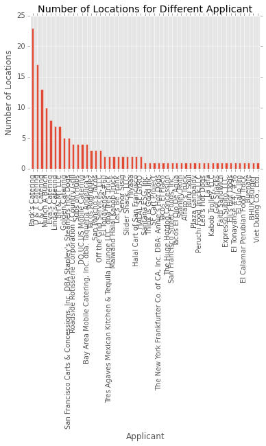
For this question, I connected the mobile_food_permits table and mobile_food_schedule table with the same permit. After selecting the Applicant field and count the distinct location id, I got my ven_loc dataframe. From the result, we can see vendor Park’s Catering sells at the most locations, which is 23.
1.2. Here I asked and use the database to analyze 5 questions about San Francisco.
import geopandas
import folium
from pyzipcode import ZipCodeDatabase
import shapefile
from IPython.display import HTML
from folium.plugins import MarkerCluster
from folium import features
Question 1 Which parts of the city are the most and least expensive?
house = pd.read_sql_query("""select * from zillow""",sf_conn)
house.head()
| RegionName | Date | ZriPerSqft_AllHomes | MedianSoldPricePerSqft_AllHomes | PriceToRentRatio_AllHomes | Turnover_AllHomes | |
|---|---|---|---|---|---|---|
| 0 | 94109 | 2010-11-01 00:00:00 | 3.156 | 675.1913 | 19.14 | 6.0771 |
| 1 | 94110 | 2010-11-01 00:00:00 | 2.566 | 599.6785 | 18.10 | 5.4490 |
| 2 | 94122 | 2010-11-01 00:00:00 | 2.168 | 495.4432 | 17.99 | 2.4198 |
| 3 | 94080 | 2010-11-01 00:00:00 | 1.666 | 369.5538 | 18.31 | 3.8757 |
| 4 | 94112 | 2010-11-01 00:00:00 | 2.322 | 422.4538 | 14.44 | 3.1288 |
house = house[np.isfinite(house['MedianSoldPricePerSqft_AllHomes'])]
house = house.reset_index(drop=True)
plt.hist(house['MedianSoldPricePerSqft_AllHomes'],bins = 30, alpha = .4)
plt.legend()
plt.xlabel('Median Sold House Price')
plt.show()
most_exp = house.loc[house['MedianSoldPricePerSqft_AllHomes'].idxmax()]
least_exp = house.loc[house['MedianSoldPricePerSqft_AllHomes'].idxmin()]
most_zip = most_exp['RegionName']
least_zip = least_exp['RegionName']
def get_location(code):
zcdb = ZipCodeDatabase()
zipcode = zcdb[code]
lat = zipcode.latitude
lon = zipcode.longitude
return [lat, lon]
most_loc = get_location(most_zip)
least_loc = get_location(least_zip)
SF_COORDINATES = (37.76, -122.45)
map_osm = folium.Map(location= SF_COORDINATES, zoom_start= 12.5)
folium.CircleMarker(least_loc, popup='Least Expensive Parts: ' + str(least_exp['MedianSoldPricePerSqft_AllHomes']),radius = 30,color='#3186cc',
fill_color='#3186cc').add_to(map_osm)
folium.CircleMarker(most_loc, popup='Most Expensive Parts: '+str(most_exp['MedianSoldPricePerSqft_AllHomes']),radius = 30,color='#3186cc',
fill_color='red').add_to(map_osm)
map_osm
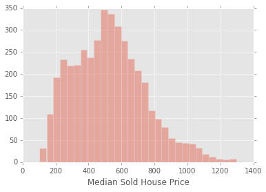
I did data query for the zillow table. Based on the field “MedianSoldPricePerSqft_AllHomes” to select the most and least expensive RegionName. We can see the Region name is in zip code format. Using the pyzipcode package I convert the zip codes to longitude and latitude of these regions and got the interactive maps with folium. The circle-style markers marked the most and least expensive parts in San Francisco. The red one is the most expensive part and the blue one is the least expensive part. The popped up texts are their respective median sold price. After zooming the map, we can see the most expensive parts are located around the Montgomery Street and the Pine Street. The least expensive parts are located on the Bayview Street.
Question 2 Which parts of the city are the most dangerous?
crimedata = pd.read_sql_query("""select * from crime""",sf_conn)
crimedata.head()
| IncidntNum | Category | Descript | DayOfWeek | Datetime | PdDistrict | Resolution | Address | Lon | Lat | |
|---|---|---|---|---|---|---|---|---|---|---|
| 0 | 150060275 | NON-CRIMINAL | LOST PROPERTY | Monday | 2015-01-19 14:00:00 | MISSION | NONE | 18TH ST / VALENCIA ST | -122.421582 | 37.761701 |
| 1 | 150098210 | ROBBERY | ROBBERY, BODILY FORCE | Sunday | 2015-02-01 15:45:00 | TENDERLOIN | NONE | 300 Block of LEAVENWORTH ST | -122.414406 | 37.784191 |
| 2 | 150098210 | ASSAULT | AGGRAVATED ASSAULT WITH BODILY FORCE | Sunday | 2015-02-01 15:45:00 | TENDERLOIN | NONE | 300 Block of LEAVENWORTH ST | -122.414406 | 37.784191 |
| 3 | 150098210 | SECONDARY CODES | DOMESTIC VIOLENCE | Sunday | 2015-02-01 15:45:00 | TENDERLOIN | NONE | 300 Block of LEAVENWORTH ST | -122.414406 | 37.784191 |
| 4 | 150098226 | VANDALISM | MALICIOUS MISCHIEF, VANDALISM OF VEHICLES | Tuesday | 2015-01-27 19:00:00 | NORTHERN | NONE | LOMBARD ST / LAGUNA ST | -122.431119 | 37.800469 |
# definition of the boundaries in the map
district_geo = r'sfpddistricts.geojson'
# calculating total number of incidents per district
crimedata2 = pd.DataFrame(crimedata['PdDistrict'].value_counts().astype(float))
crimedata2.to_json('crimeagg.json')
crimedata2 = crimedata2.reset_index()
crimedata2.columns = ['District', 'Number']
plot = crimedata2.plot(x = 'District', kind = 'bar', legend = None,
title = 'Number of Crime Incidents for Different District')
plot.set_ylabel('Count')
fig = plot.get_figure()
# creation of the choropleth
map1 = folium.Map(location=SF_COORDINATES, zoom_start=12,tiles = "Stamen Terrain")
map1.choropleth(geo_path = district_geo,
data_out = 'crimeagg.json',
data = crimedata2,
columns = ['District', 'Number'],
key_on = 'feature.properties.DISTRICT',
fill_color = 'YlOrRd',
fill_opacity = 0.7,
line_opacity = 0.2,
legend_name = 'Number of incidents per district')
map1
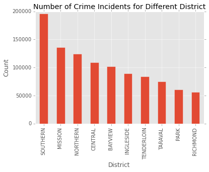
To analyze the crime occuring frequency in different parts of san francisco, I would like to create a choropleth. First, I need a geojson file to create the areas that match the San Francisco police districts in the data file. With a Google search on “sfpd districts geojson” reference, I found the file that matches my needs.
The choropleth is based on the aggregated counts of crime numbers. The choropleth map like above with a legend in the upper right corner. Different colors reprensents different counts of crime occuring. From the map, we can see crimes happen most frequently in the deepest red region, which is the most dangerous parts. We can conclude that southern san francisco is the most dangerous and Richmond is the least dangerous.
Question 3 How are schools distributed in the city? Which area mostly schools are located in? Is there any relationship between school location and crime incident?
school = pd.read_sql_query("""select * from schools""",sf_conn)
school = school[np.isfinite(school['Lat'])]
lons = school['Lon']
lats= school['Lat']
school.head()
| Name | Entity | LowerGrade | UpperGrade | GradeRange | Category | LowerAge | UpperAge | GeneralType | Address | Lat | Lon | |
|---|---|---|---|---|---|---|---|---|---|---|---|---|
| 0 | Alamo Elementary School | SFUSD | 0 | 5 | K-5 | USD Grades K-5 | 5 | 10 | PS | 250 23RD AVE, San Francisco, CA 94121 | 37.783005 | -122.482300 |
| 1 | Alvarado Elementary School | SFUSD | 0 | 5 | K-5 | USD Grades K-5 | 5 | 10 | PS | 625 DOUGLASS ST, San Francisco, CA 94114 | 37.753681 | -122.438194 |
| 2 | Aptos Middle School | SFUSD | 6 | 8 | 6-8 | USD Grades 6-8 | 11 | 13 | PS | 105 APTOS AVE, San Francisco, CA 94127 | 37.729672 | -122.465782 |
| 3 | Argonne Early Education School | SFUSD | -2 | 0 | PK-TK | USD PreK/TK | 3 | 5 | PS | 750 16TH AVE, San Francisco, CA 94118 | 37.773968 | -122.474060 |
| 4 | Argonne Elementary School | SFUSD | 0 | 5 | K-5 | USD Grades K-5 | 5 | 10 | PS | 680 18TH AVE, San Francisco, CA 94121 | 37.775307 | -122.476311 |
data = np.array(
[
np.array(lats),
np.array(lons),
range(len(school)), # Popups text will be simple numbers.
]
).T
m = folium.Map(location= SF_COORDINATES, zoom_start= 12)
mc = features.MarkerCluster()
for k in range(len(school)):
mk = features.Marker([data[k][0], data[k][1]])
p = features.Popup(str(data[k][2]))
mk.add_child(p)
mc.add_child(mk)
m.add_child(mc)
# add choropleth map of crime to the school map
m.choropleth(geo_path = district_geo,
data_out = 'crimeagg.json',
data = crimedata2,
columns = ['District', 'Number'],
key_on = 'feature.properties.DISTRICT',
fill_color = 'YlOrRd',
fill_opacity = 0.7,
line_opacity = 0.2,
legend_name = 'Number of incidents per district')
m
The map above shows the distribution of schools in San Francisco. The number in the circle reprensents the total number of schools in this area. You can zoom in and zoom out the map to see the specific location for each school. Based on the result for Question 2, crimes happen most frequently in the deepest red region, which is the most dangerous. From the map, we can see most schools are located near the dangerous areas. In other words, most crimes occur near the school areas. It’s concluded that there is relationship between school and crime incident. We can refer that most crimes are related to children and students, which also accords with the reality.
Question 4 Which types of noise are most and least complained? Which parts of the city have most noise cases?
noise = pd.read_sql_query("""select * from noise""",sf_conn)
noise = noise[np.isfinite(noise['Lat'])]
# calculating total number of noise case per type
noise2 = pd.DataFrame(noise['Type'].value_counts().astype(float))
noise2 = noise2.reset_index()
noise2.columns = ['Type', 'Number']
plot = noise2.plot(x = 'Type', kind = 'bar', legend = None,
title = 'Number of Noise Case for Different Type')
plot.set_ylabel('Count')
fig = plot.get_figure()
lat = noise['Lat']
lon = noise['Lon']
type_ = noise['Type']
data = np.array(
[
np.array(lat),
np.array(lon),
np.array(type_), # Popups text will be simple numbers.
]
).T
noise_m = folium.Map(location= SF_COORDINATES, zoom_start= 12)
mc = features.MarkerCluster()
for k in range(len(noise)):
mk = features.Marker([data[k][0], data[k][1]])
p = features.Popup(str(data[k][2]))
mk.add_child(p)
mc.add_child(mk)
noise_m.add_child(mc)
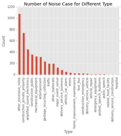
From the table above we can see, the type of other excessive noise is most, which has 1080 cases. The top two type is construction private property, which has 744 cases. The least number cases are happened in hospital. There are only 4 cases from August 2015. Among all these types, we can see most noises come from construction and electronic equipment. Noises that come from vechiles and traffic are not that much. According to the map, the number in the circle reprensents the total number of noise cases in this area. You can zoom in and zoom out the map to see the specific location for each noise case. The popped up text shows the noise type for each case. We can see most noise complaints were reported in central san francisco area. It’s because there are more population and stores, which cause more noise.
Question 5 How are the mobile food vendors distributed for different facility types?
sql_query1 = """
select locationid,Applicant, FacilityType, Longitude, Latitude
from(
select *
from
(select *
from mobile_food_schedule
left join mobile_food_permits on mobile_food_schedule.permit = mobile_food_permits.permit
where mobile_food_permits.Status = 'APPROVED'
) a
left join mobile_food_locations on mobile_food_locations.locationid = a.locationid)
"""
vendor = pd.read_sql_query(sql_query1,sf_conn)
vendor = vendor.drop_duplicates()
vendor = vendor[vendor['Longitude']!= 0]
vendor = vendor.reset_index(drop=True)
vendor.head()
| locationid | Applicant | FacilityType | Longitude | Latitude | |
|---|---|---|---|---|---|
| 0 | 654163 | Maiwand Halal Kabob Truck | Truck | -122.402314 | 37.793393 |
| 1 | 654165 | Maiwand Halal Kabob Truck | Truck | -122.397043 | 37.793214 |
| 2 | 676176 | The Huge Hotdog Concession | Truck | -122.420091 | 37.788877 |
| 3 | 676797 | Peruchi Food Truck,LLC | Truck | -122.397273 | 37.796123 |
| 4 | 680504 | Halal Cart of San Francisco | Push Cart | -122.402567 | 37.793149 |
Lat = vendor['Latitude']
Lon = vendor['Longitude']
Type = vendor['FacilityType']
Name = vendor['Applicant']
vm = folium.Map(location= SF_COORDINATES, zoom_start= 12)
for i in range(len(Type)):
if Type[i] == 'Truck':
folium.RegularPolygonMarker([Lat[i],Lon[i]],
fill_color='red', radius=12, popup=Name[i]).add_to(vm)
if Type[i] == 'Push Cart':
folium.RegularPolygonMarker([Lat[i],Lon[i]],
fill_color='#43d9de', radius=12, popup=Name[i]).add_to(vm)
vm
In the map, I used polygon markers to mark the mobile food vendor in San Francisco. The red ones represent the truck vendors and the blue ones represent those push cart vendors. The popped up text show their respective vendor names. From the map we can see most are truck vendors. And for truck vendors, they are located all over the city. But for push cart vendors, they are more centralized. Based on the result of problem 1, we know that some vendors sell at many locations, like Park’s Catering, D & T Catering and so on. For most of these vendors, all of their locations are not very far from each other, like D&T Catering. To be mentioned that vendor Eva’s Catering sells dispersedly.